Image Editing
To make these images, I used GIMP and Inkscape image editing software.
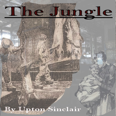
I chose to use Upton Sinclair’s The Jungle (1906). This book is commonly referenced in 11th grade U.S. History curriculum when learning about factory working conditions in the early 1900’s and some of the reforms that were passed to address them. Ironically, Sinclair did such a good job of describing the appalling conditions of food processing in meatpacking plants that this book was cited as the reason for health and sanitation reforms instead of working conditions.
Because the story takes place at the beginning of the 1900s, images and photos at the time would not have been colorized, but either in sepia tones or black and white. Therefore, I chose to keep the color palate of the primary images muted. The title of the book is in dark red, so as to stand out but not to be bright and out of place. I chose red as the accent color specifically because as the main character progresses through the hardships of life as an immigrant worker in a meatpacking plant, his politics become increasingly aligned with the radical socialist labor movement and red is a color politically associated with labor uprisings. As for the images chosen, I used the iStock database to find photos and illustrations which represented the setting of a meat packing plant. I also used a part of a larger illustration depicting a Swedish immigrant mother and baby, because the story opens up with the wedding of the main character to his young bride shortly after arriving in America to pursue a better life than what they left behind in Sweden.

Both of my sons have played baseball for several years now, and our shared experience is the inspiration for my design. I decided to design a logo for a fictional baseball mom’s social media account. The background is shaped like an Instagram icon and is the color and texture of a baseball field. I decided the main logo should be simple, with a dimensional baseball shape and the lettering “Baseball Moms” in red to mimic the laces. I wanted the lettering to be the laces specifically because we quite literally hold our players and the team together. Suppliers of snacks, keepers of ice packs and first aid, finders of lost cleats, and providers of moral support – regardless of the scoreboard.
To achieve these effects, I started with the rectangle tool in Inkscape. Once I had a square, I used the corner controls to round the edges. Next, I modified the shape fill color to a green like turf. Next, I found a texture to import as a new layer that was close to grass. I adjusted the opacity so that the texture appeared to be subtle instead of the dominant part of the logo. Next, I used the circle tool to create the center baseball. I clicked on Filters, Materials, and selected 3D mother of pearl to give the circle some dimension. Then I added two separate text boxes and chose a script font for “baseball” and “moms.” In order to curve the text, I had to convert each textbox into a path. Once that was done, I clicked on “Path effects” and selected the line tool so I could click and drag each text box into a curved shape from the middle of the words.